About Me

My photo
I specialise in photographing moments of tenderness so I tend not to do posed portraiture and instead prefer to work unobtrusively at family gatherings

Monday, September 21, 2009

Should a photographer refuse Indian weddings when they aren’t in a maharajah's palace in Rajasthan?

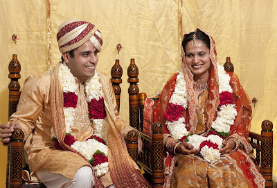
I was asked to photograph an Indian wedding that was organised very quickly, within a week; an auspicious day not to be missed meant very little planning so when I drove to the venue in Sydney on the wedding day, I had no idea of what to expect though I doubted it would be a magnificent maharajah's palace since there aren’t any in Sydney's suburbs!

The venue turned out to be a brick house. At this point I could have jumped up and down, outraged that the venue wasn’t even a temple but rather than take on reality and lose, I did what all professional photographers do and looked around for opportunities.

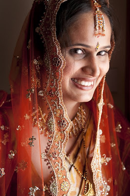
Where to photograph the bride? The house’s front door had a glass decorative panel and since the house faced North East, I was able to take advantage of the morning sun streaming through the door’s glass panel. The location wasn’t ideal – a light switch threatened to feature prominently in any photo, the glass panel was at chest height meaning anyone wanting to take advantage of the ideal 45 degree light would have to ask the portrait sitter to crouch down and even worse, it was the front door which meant I couldn’t have an elaborate set up or the guests wouldn’t have been able to enter the house. So what to do?

Here is a “location shot” to give you some idea of what I was faced with.


Below is the final photo, taken within 5 minutes of this location photo – no flash has been used, both sides of the bride's face are illuminated because I took advantage of the lighting reflecting off the walls and most importantly and the bride is not apprehensive or impatient because I worked quickly. I showed the bride the photo immediately afterwards and from then on, any doubt the bride might have had about whether I was able to photograph her at her best disappeared.


The wedding ceremony was housed in a mini tent that was within a marquee in the back yard- it would be safe to say that the natural light was dismal, no beautiful 45 Degree light, just dull light struggling to get though two layers of canvas.

Here is the location shot of what I was faced with:
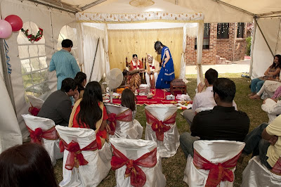


The location shot is slightly misleading because the mini tent is illuminated since I had placed a flash in the mini tent’s ceiling that fired upwards into its ceiling via remote control (no messy wires tripping up the guests). This turned the humble mini tent into a Bollywood film set. Having the flash fire into the ceiling also meant the wedding couple weren’t being blinded by direct flash. It also meant that I could move around and photograph the couple from various angles knowing that the front of their faces would always be exposed.

Below are some examples :
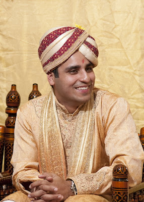


I wanted to take photos of the couple from the side. Since the bride was sitting in a chair next to the groom, I was faced with deciding who was going to be blurred, the bride or the groom. But rather than make such a decision, I photographed firstly the groom, then the bride and when I got home, I merged the two images to get the couple both beautifully sharp.

Here is the before photo of the bride that was used to make the final image.
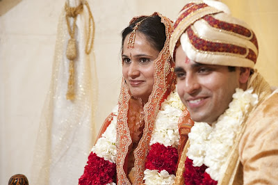

Here is the final image showing both bride and groom in perfect focus:
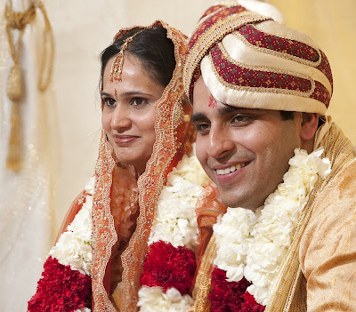


I also took candid shots of the guests. In my experience men are far more difficult than women to photograph so the secret is not to let them know you are photographing them which means no poses and no flash: here are two candid images:


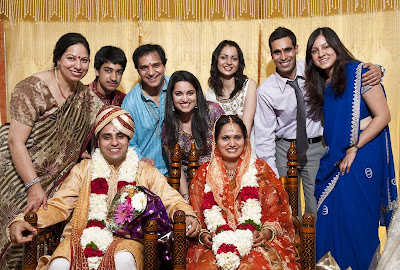
After the wedding ceremony, I took advantage of the lighting set up to photograph the family in the mini tent:


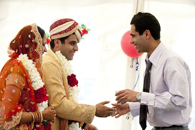
But how to cope when the couple left the mini tent to mingle with their guests in the marquee? I abandoned the flash and took candid photos making sure that the white canvas walls of the marquee did not confuse my camera’s exposure. Then, when I got home, I brought out the magic of the images but altering their exposure and tonality.

Here is a before and after photo of the couple greeting a guest where I have deliberately ‘blown out’ the scuffed walls of the marquee and its plastic window so nothing detracts from the warmth of the greeting.



I then took photos in the house. The living room had a lovely plain white wall and white ceiling so I asked one guest to point the flash at the side wall whilst fired my on-camera flash into the ceiling. This enlarged the apparent light source to give a lovely soft feel to the portraits since the light wraps around the face using this lighting technique. In short, I turned a living room of a suburban house into a professional light studio within two minutes. Here is one image from this 'studio':
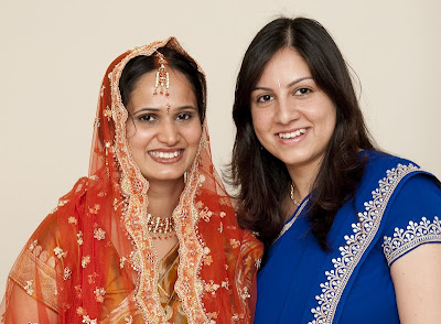


In conclusion, I was able to take great photos because I never tried to fight reality. I accepted the location for what it was, a house in suburbia, and then worked out how to best capture the wedding day. To see more photos from the day, click on the link: http://www.johnslaytor.com.au/slideshows/celebrations/hindu_wedding_sydney/index.html

Friday, September 18, 2009

A review of four on-line photobook publishers available in Australia

I have developed a funeral photography business www.thefuneralphotographer.com.au. Integral to my service offering is the Memorial Book, a photo book which contains images of the funeral service, hobbies and objects special to the deceased such as their garden and objets d’art.


For two years I have used Asukabooks but became disillusioned with them. Whilst the quality of their books is superb (I rate them eight and half out of ten, with Asukabooks losing half a mark because of barcodes), I had six complaints.

Firstly my biggest gripe was that Asukabook did not provide book publishing software which meant that I had to generate the books within Adobe Photoshop. Whilst I developed a good system using Smartobjects within Adobe Lightroom, it was no substitute for dedicated software. It meant a book took up to fifteen hours to design and one that could never be modified in front of the client as the process was too cumbersome. Asukabook does offer dedicated software which looks glamorous but is very simple- being in its first edition, it lacks sophisticated options if one compares it to Momento’s software. I understand that Photojunction offers unofficial support for Asukabooks but I could see myself getting caught between these two companies and wearing the cost when something went wrong with a book design. I am also unfamiliar with Photojunction, a process not helped by its own website video tutorials not working for three days when I was interested.

My second complaint was that there was no pricing transparency. I would upload an order and within days my credit card would be debited. I would only get an invoice when I received the final product and the invoice was wrong more than once, once I had been overcharged by more than $150.

Thirdly, the page margin for error resulted in one book being unusable because the text had been cropped notwithstanding that it was within the safety margins of the page template – Asukabooks subsequently advised me that I could not rely on the safety margins of the template it provided and always had to allow for an additional ¼ inch. Asukabooks did not offer to reprint the book free of charge.

Fourthly, there were no volume discounts, even when I ordered 14 copies of one book and it seemed unfair given my own client’s expectations.

Fifthly, I hate the fact that Asukabooks insists on a strange barcode being both on the back cover and on the back inside page. In my opinion, this compromises the book cover design and looks ugly.

Sixthly, Asukabooks forces you to work in multiples of ten pages. So if you want to have a 42 sided book, you have to pay for fifty sides and put up with 8 blank sides.

So with these reasons, I started to look around and accepted that I might have to use Windows software (I have always used a Mac).

I first tried Click-on-Print http://clickonprint.com.au/ . Its Windows only software was easy to use and I had no problems sitting down with a client and substituting images and modifying page designs.

The software’s major weakness was that I wasn’t able to vary the opacity of images. For example, if I wanted a background image muted by reducing its opacity to 20%, I couldn’t do it within the software and instead would have to create the image within Adobe Photoshop, reduce the opacity, save the image and then transfer it from the Mac OS to the Windows OS. Needless to say this discouraged me and when I asked Click-on-print if they were likely to introduce opacity modification for images in their software they replied they had no plans to do so at the present time.

All in all, I thought the software ranked about seven out of ten. It encouraged me to play with page layouts.

In my opinion the quality of the Click-on-print books was four out of ten. Whilst the colour accuracy was good, the books suffered as follows.

Firstly, there was hideous warping on the inside covers presumably from excess glue.


Secondly, the side of the pages seemed to be smudged with ink lines.


Thirdly, the pages were warped


Fourthly, the glossy front cover seemed excessively vulnerable to scratching.

Fifthly, you could see the stitching in the centre of the pages when the book was open.

Click-on-Print gladly offered to reprint the books when I raised these problems but the subsequent reprints weren’t much better in my opinion.

I rate the Click-on-Print book four out of ten.

Next I tried photobookaustralia.com.au. Its software was good (I rate it seven and a half out of ten), available for both Macs and Windows.

I was able to create a book within four hours which I thought was great. I also like the fact that you could create new page templates and save them. My main gripe with the software was that once the book was converted into a pdf file ready for uploading, I couldn’t review it for errors as the software repeatedly crashed . Photobookaustralia made suggestions about how I could rectify this situation but they didn’t work.

Unlike Momento, the software doesn’t generate a mini PDF (ie a file under 10 mb) of the final file which made it difficult to share with clients; I would have to shrink the software generated pdf within Adobe Acrobat but I am yet to do this as I don’t have Adobe Acrobat. Unlike Momento you get penalized timewise when laying out pages if you don’t decide on the layout before you select the images for the page.

The ordering process was excellent – it was easy to understand various options and place my order. I also liked photobookaustralia’s tracking system which kept me informed.

When ordering the book, I chose 6 ink printing and 170 GSM satin paper.

I was pleased with the results when I received the book. The colour was spot one, the sharpness of the images perfect and I liked the smart look of the black inside covers (every other book publisher has standard white inside covers which isn’t as good in my opinion; some charge extra if black inside covers are required). I was thrilled that photobookaustralia doesn’t insist on barcodes anywhere in the book unlike every other publisher mentioned in this article.

My three gripes were that the pages were slightly rippled (unlike those of Asukabook or Momento which are dead flat), it wasn’t possible using the software to generate text for the spine (I would have had to do this in Photoshop using a template cover page and upload it separately for no additional charge) and the cover didn’t feel as durable as those of Asukaboks or Momento. Interestingly, photobookaustralia subsequently advised me that they have discontinued satin book covers since they aren’t very durable. I rate the book eight out of ten.


Finally I tried www.momentopro.com.au. Its Windows only software is excellent, very stable now in its 5th edition and the momento software encourages experimentation since you can easily drop images onto a page without worrying about how they will be placed (one of my gripes about photobookaustralia’s software). My first gripe with Momento’s software was that I couldn’t save page templates so I was forced to use those provided in the software. My second gripe was that I had to generate each page which gets tedious if making a seventy page book My third gripe is that the software cannot generate images on the back cover – for a $20 premium I could submit a jpeg image to rectify this but it seemed silly. I rate the software eight and a half out of ten.

The software was very stable once I had conformed to its requirements. Firstly, when numbering images, make sure you have a three prefix numbered system e.g. Image001, image002 otherwise the software sorts them as follows image10, image100, image101, image 11…

Secondly, if you have the same image names but in different folders, the program cannot cope and scrambles page thumbnails.

The ordering system is good though not in the same league as that of photobookaustralia.

I was disappointed when I received the book. In my opinion the colour space of the front cover was seriously wrong, skin tones were unduly pink. The colorspace of the pages was fine though the satin paper, whilst it lay beautifully flat, had a dead feel to it unlike photobookaustralia’s satin paper. Some of the pages also had tiny grey spots on them. It was also annoying to have a barcode on a page of its own at the back of the book (which also looks odd, as if I have made an error), particularly since a Momento staff member assured me there weren’t any barcodes. As a result of the above, I rate the book seven out of ten.

In conclusion, in an ideal world I would use Momento’s software albeit with photobookaustralia’s ability to save page templates and create back pages to generate a book with Asukabook’s cover and book size offerings (e.g. 7” x 7”) but using photobookaustralia’s inside black coverss which would then be presented in the hard plastic book sleeves provided by Asukabooks. Because I live in the real world, I have selected photobookaustralia as my preferred book supplier.

Monday, August 17, 2009

Portraits v Pictures


In my view, only a self-revealing portrait is beautiful and if a photo of person isn't self-revealing, then it isn't a portrait.

Photographing adolescent females in our society is challenging since they are acutely aware of their projected image and tend to do whatever they can to alter themselves to conform to their perceived ideal self. Since the stereotypical adolescent female image is cloyingly sweet, or sexually mature beyond her years, in my view this stereotype lacks beauty because who ever adopts it lacks self-revelation. Observing my own daughter, I have found that adolescent females reveal themselves in piques of anger, possibly because fury displaces control, and it is this self-revelation that interests me. I only wish that the circumstances that give rise to the self-revelation were calmer.

I am intrigued by the paradox that contrary to the stereotype, adolescent females are beautiful when they are angry.

The images below show the transformation of an adolescent female, from contrived posing to fury. The trigger for her fury was a male: her younger brother.


Tuesday, June 2, 2009

Why the National Geographic isn't for me


Better to reject than be rejected!

In April 2009 I was engaged by the Naandi Foundation in India to photograph an inaugural coffee competition and then the area in which the judged coffee was grown, the Araku Valley, a tribal area. In the Hindu caste system, tribes rank below untouchables so these peoples' lives were grim, particularly once the British cut down the forests which sustained these people. The Naandi Foundation sought to improve the tribes' lot by turning them into coffee farmers which was possible given the high elevation of the tribal area.


In the brief time that I was in the Araku Valley I was able to photograph many villagers who associated me positively with the Naandi Foundation and therefore weren't reluctant to be photographed. The photos are good, distinct faces, unique nose jewelry worn by women, lots of colour.


So why have I lost interest in venturing into remote areas to photograph colourful people? The answer is that without living with them for months, all I can do as a photographer is be a grinning encouraging foreigner with a camera. There is no dialogue beyond the initial smiles and that's my frustration. Yes, I've gone beyond the stony faced suspicious look and avoided the coerced uneasy pose but I haven't been able to document the person at ease in their environment.


So until I am prepared to make a serious commitment, I'll stay fixed in Sydney where I am flat out photographing Hip Hop artists, unique creatures in that they seek me out to be photographed!

Friday, May 29, 2009

hip hop shots


A nineteen year old wants a photo for his album cover. This is no awkward teenager but a professional image maker and for four hours I photograph him.

Like any performer, and like me as a photographer, he needs to warm up - I use the poor light of a rainy day that filters through the open window to give him confidence, educating him, involving him by explaining as I shoot how I am sculpting the light on his face. I want him to understand that any request I make is to enhance his image, not mine.

In his first photos he almost looks like a boxer, silent with a white towel. The natural light is a challenge, it makes me slow down, makes me interact with him. Initially we need to work together but soon he'll gain enough confidence to do his routines without any encouragement.

As I show him the resulting photos he gains confidence and the showman in him begins to come out. I do little to encourage him as I working with the light and he with his image. Sometimes I don't see him as person but as a living reflector and absorber of light. Occasionally I direct him when something he does catches my eye - his hands at one point, another is his ottaman look as he wears his baseball cap sideways.


Once he is self-assured, I move on from natural light to flash - two umbrellas and strobes. Using flash can be tedious since it is such a controlled and predictable light and if I am not careful, I go into autopilot and switch off but because I have set the stage, so to speak, he is by now very engaging from his sheer self-confidence.

In his initial shot you can almost see him psyching himself up before he goes onto the stage, a white backdrop.


Then I steer him a little, suggesting he pose "for the ladies".


I use a 42" covered umbrella very close to him to exaggerate the mirror sheen of his body with a secondary open 32" umbrella acting as fill.

At the end he is tired, reflective, his performance has drawn his energy.

Wednesday, May 20, 2009

Anatomy of a coffee shoot


Further to my last post, I've had a lot interest in the ultimate shot of George, the coffee roaster. Some skeptics don't believe that it was a quick shot in less than ideal conditions and lots of people want an understanding of the technical issues I had to deal with.

So this post isn't about the psychology of a portrait sitting but more the nuts and bolts of how to shoot an environmental portrait.

To convince you I wasn't in a studio, I've taken the before shoot. For the record, this was taken at 2.26pm or seven minutes before the final shoot.


There's a lot not to like about this image. The uniform lighting doesn't make George the focus of the image. Instead there is a clutter of things that catch the eye - the square control box, the wiring on the back wall, the blue ducting running vertically on the support beam. Even worse, George doesn't look trim though he looks like he is geared up for work since I asked him to wear an open necked shirt and casual jacket. He's not looking at the camera and that was intentional. George is a busy guy and the last thing he wants to do is waste time looking at a camera when the photographer is still planning the shoot.

This image helped me to decide where to place George; either to the left or to the right of the roaster machine. Since the square contol box was distracting I decided that George would stand in front of it so the coffee machine would be to his left.

Next I didn't want to see anything but George and the roaster machine, no cables, no wiring... A 32" flash umbrella was placed about 1 metre to George's right: the flash umbrella was used to turn the small hard light wireless-controlled flash into a large softer light source which would flatter George.

But a small flash doesn't travel very far and didn't illuminate the roaster machine. This meant that I could use another wirelessly controlled flash that aimed a tight light beam (105 mm setting on the flash light) at the roaster machine. An enormous advantage of using two distinct light sources is that the resulting photo will be far more interesting simply because it is not only a portrait but also a study in lighting conditions.

The shoot done, I then reviewed the ensuing fifteen images on my computer and decided that the shot below had potential.


But there were a few problems with it. A horizontal bar below George's coat was distracting because it was a bright regular shape:


It had to go and so did a point source of light, both elimated using the clone and Exposure brush tools in Adobe Lightroom :


Now to George - fortunately he is a good looking bloke so there wasn't too much to do - eliminate a sunspot on his right cheek and freckle on the bridge of his nose and lighten his left side. The sunspot and freckle elimination took 10 seconds using the clone tool in Adobe Lightroom.


The lightening of his face was more complicated because as human beings, we are very diligent when scanning faces and the slightest fudging is apparent. I created a virtual copy of the image within Adobe Lightroom and then used the Adobe Lightroom 'fill light' command to lighten the left side of his face until it looked good (which meant his right hand side was over light.


Then I opened the two images as a two layered document within Adobe Photoshop (one correctly exposed for Gorge' right cheek, the other correctly exposed for George's left cheek). I then masked the lighter image and carefully concealed some of the mask in order to expose the lighter image by using a very low opacity brush.


Finally I had an image I was happy with, or was I?


The Develop Module of Adobe Lightroom is able to process your image in different ways using 'User Presets' so I applied some of them to the image hoping that one or more of them might guide me in enhancing the portrait.


Neither of the above two interpretations, 'Antique Lighting' and Faded Elegance', helped me but the next one, 'Direct Positive' did.


I loved how punchy the image became and the background clutter was elimated leaving just George and the roaster machine. But a problem, Geoerge looked about to die from jaundice and the darker side of his face had become almost obscured. I solved the jaundice problem by changing the colour temperature of the image. I lightened George's face using the technique described earlier. Then George's top shirt button was eliminated using the clone technique since it was distracting.

Finally an image I was pleased with. George looks handsome and professional, his creation behind him bathed in a bluish light emphasising his scientific approach to coffee roasting.

Wednesday, May 13, 2009

Mug shots


George Sabados is the founder of GS Roasting, a wholesale coffee roastery in inner-city Sydney, and to the chagrin of many coffee aficionados, he doesn't retail coffee, though that maybe about to change hence me being commissioned to photograph him for several websites currently under wraps.

George not only roasts coffee, he is a coffee judge of international renown and is an expert in turning around cafes. He is also a great bloke and happiest when not buttoned up in a suit.

So many roles means that one photograph cannot do. George needed three photos, as a good bloke you would want to engage to sort out an underperforming cafe, as a gun coffee roaster and as a coffee consultant.

So how to produce three distinct images in an hour? George's office wasn't glamorous, a computer station, reams of paper, invoices, standard lighting, nothing you would want to see so when I set up the shoot in his office, I avoided the CEO at his desk look (which works if the CEO has a magnificent oak bureau but not if it's an Officeworks $99 special) and went for a very simple shoot - just George and the innocuous venetian blinds behind him.

To warm him up, get him used to the camera, I asked him to wear a casual shirt. Initially he sat at his desk but George is a doer, happiest when he is working. Once standing, the photos started to work but a problem, George was even too casual in the first photo notwithstanding you immediately smile when you look at it. The solution, not a reshoot but a tight crop - thanks to high end full frame DSLR cameras, you can get a fantastic image even if you use 1/5th of the frame.


Then to the suit shot. The whole point of wearing a suit is that it disguises your individuality - the term "suit" doesn't exactly conjure up a fun guy so as a photographer, there's no point fretting if the image doesn't 'sing' and give you visions of winning the Pulitzer Prize. Maybe if I had spent a day tricking up the lighting, I could have got a memorable result but instead, I got the suit shot.


I then focussed on what I really wanted to photograph - an environmental portrait of George, his environment being a bespoke coffee roaster that has allowed him to produce exalted coffee blends. The circumstances of this part of the shoot weren't ideal - roasting was about to begin in five minutes so the workers were loading beans and preparing boxes and a forklift truck was whizzing around alarmingly close to my gear. Worse still, a machine had just broken giving George and his offsider, Rudy, a major headache. So a quick two light set up, a naked strobe lighting the roaster and a flash umbrella lighting George.

Wednesday, May 6, 2009

The four faces of Bella


Child portraiture is fraught with difficulty since you are effectively dealing with not just one client but four: the child, the mother, the father and yourself and at some point, you have to decide who will be writing the cheque and focus on meeting that person's expectations. Or do you?


When Bella came to my studio she had clear expectations in mind - just as a hairdresser might be shown Nicole Kidman's latest look in a glossy magazine and told to replicate it, Bella showed me images on the web that she wanted for herself. Once upon a time I could have pretended to comply with her wish and then quietly ignored it but now that every eleven year girl has a digital camera and knows images can be instantly reviewed, I cheerfully complied. Bella's request wasn't ideal, it didn't suit her, but that didn't matter since until she felt I had met her expectations, there was no point worrying about anyone else: you cannot photograph uncooperative subjects and they will be uncooperative if they feel they cannot trust you.


Once Bella's expectations had been met, I wanted a more natural look to please her mum but how to achieve it?I decided to use a studio prop, a burgundy felt hat. Unless the portrait sitter is a raging extravert, they will take time to thaw and shrug off that hounded or coerced look. But you don't have a lot of time in a studio. Somehow, by giving the portrait sitter a studio prop they relax at lot faster. Perhaps this is because they feel they are no longer the subject. Who knows? I don't but the results speak for themselves.


By now the portrait session will be half finished and the subject will be comfortable enough to do away with the prop so it's time to experiment in order to photograph them at their best. Changing backgrounds and alternating between natural light and flash ensures that I as a photographer, am alert to every nuance of the subject's features as the lighting changes.


By the end of the forty minute session, I have satisfied my four clients. Forty minutes might seem short but any longer and the child will get bored.